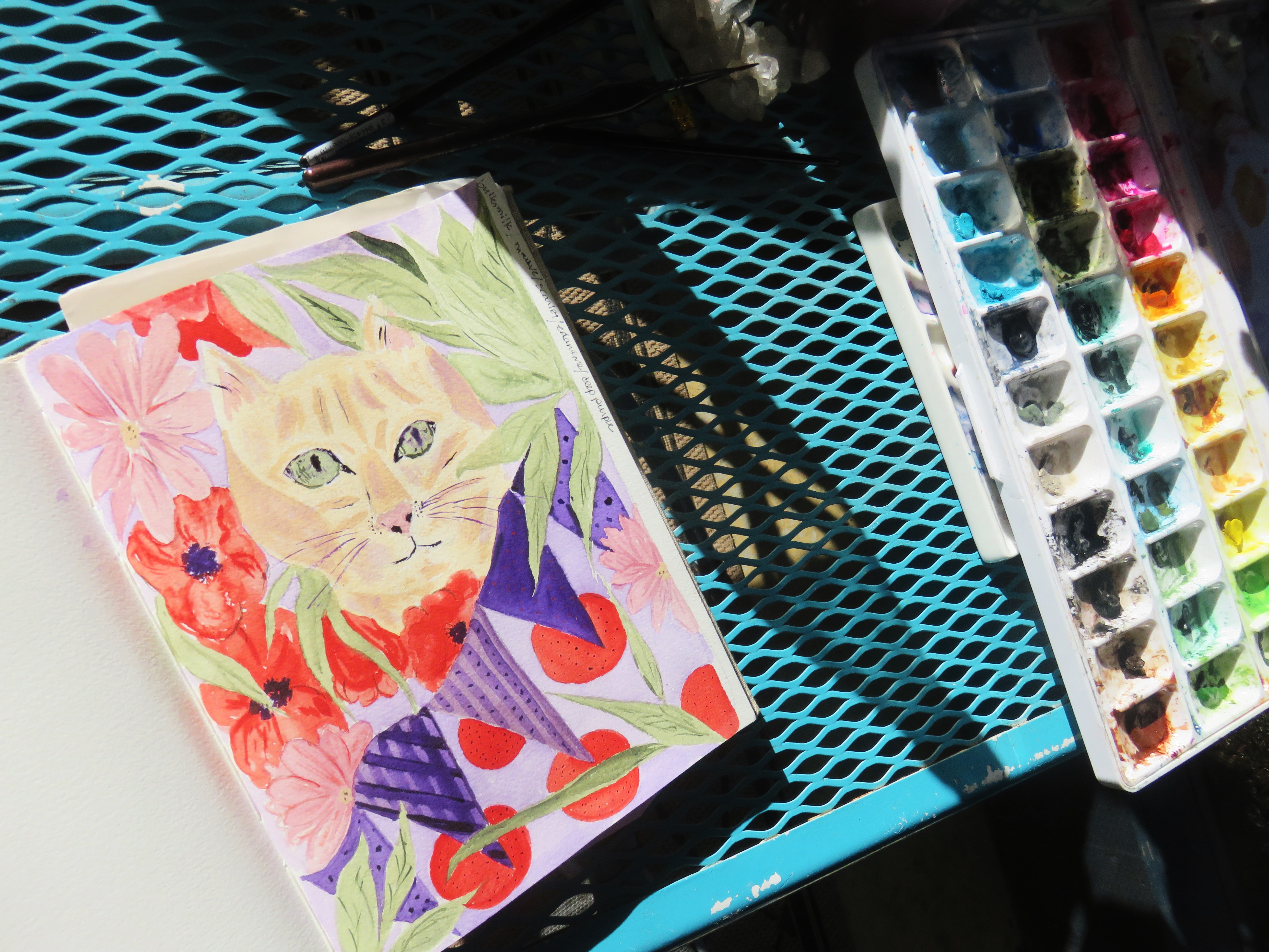
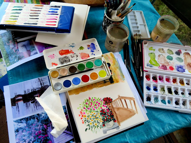
More from art camp where our supervisor is taking a break!
For the first time I decided to have specific goals. They were to:
Use materials new to me, including the pan pastels Kate gave me for my birthday and my watercolor brush markers;
work outside my comfort zone and rely a little more on drawing it all instead of tracing through the key outlines with graphite paper;
learn to work a little more freely and creatively and to
watch some instructional videos instead of just diving in!
Kate's goals were to complete two or three of her pages for her 2020 bird calendar which she does every year for our November sale.
So, how did we do?
Let's start with new materials. My first efforts at the pan pastels were not great! (A first time, what can you expect?!) But I like this new mediium, both for using on its own, like this cat...
...or sunset.
I was probably happiest with this bunny. Still not right, but all pan pastels. They have wonderful blending qualities.
You can also use them on watercolor. I did this sunset scene from one of my photos in watercolor, then enhanced the water and sky with pan pastel. It's not my best work but it was good practice.
Remember this one? I enhanced the sky and ground with the pan pastels here, too, and I like it much better than the initial version. It's a little brighter and has more energy.
The sunflowers were also a watercolor, enhanced by pan pastel.
I also learned that when you are finished with the work, you have to spray it to keep the pastel from "spreading" its color on just about anything you come into contact with!
Kate graciously sprayed mine because of my lung issues. I'll have to wear a mask when I do this at home. The stuff is seriously stinky!
I'd say I really enjoyed working with the pastels and will continue to use them often. I suspect I will probably use them more for highlighting watercolor than independently, but when I watch some of the videos on the
soffttools site, I am amazed at their potential. (And by the way, watching those videos helped meet another of my goals!)
Another new material to me was my watercolor pens. I've had these a few months and fiddled with them and can't say they knock me out but I did get some practice with them. I'm inclined to think that they will be most used for adding detail to my regular watercolors. Maybe it's just this brand -- Arteza -- but they don't seem to blend very well. Most all of the blending below came from -- you guessed it -- the pan pastels!
Another goal was to incorporate my drawing or sketching more than I usually do into my art. Quite often for the main outlines or details, I will sketch in over a graphite paper, an erasable paper similar to carbon paper. This helps keep my lines straight and proportions right but even though I know a ton of artists who either use this method, a light box, projections or pencil-scratching on the back of a photo and tracing over the main lines onto the painting surface, I feel a teeny bit like it's cheating. So the sketch below is from hand only -- looking at a photo.
Then I drew it freehand onto my watercolor paper. (To be honest, I like the sketch better!) I painted it in, enhanced the sky with the pastels and then added some sketch detail lines. It's a little wonky but I kind of like it!
And this one was just free-drawn from a Paris photo I took of the bouquinistes. I did this in pencil and added the back detail lines later. I'm still not gung ho on the bookcase. There was so much shadow in the original, I'm not sure I could really get it like I wanted. But I still feel really happy with this one overall.
I often feel my painting is a little tight -- a little too detail-oriented, a little over-painted. Not long ago I shared this book of wonderful watercolors from Paris., rene Ochia's "Carnet de Paris 7e & 15e Arrondissements."
I like the style of the sketch as well as the fading out of the extraneous material. Earlier this summer I did this one. (At least one blog reader should recognize this setting!) If you note, it is "fully painted" and it's harder to find the subject of the painting -- the fellow with the bicycle.
This is the re-do. I like it much better. By lightening up the building next door to the house, the cyclist shows up better. He will show up even better when I add another gentle layer of blue to his shirt!
I also did a couple of Christmas cards and this one -- a get well card.
All in all, a good body of work.
And how did Kate do?
Very well! She finished two of her paintings for her 2020 calendar and the preliminary sketch for her last page. Happy camper indeed!
I leave you with a burst of color, courtesy of the sky.
Future painting, maybe?
Sharing with:
Let's Keep in Touch /
The Creative Connection /
Best of the Weekend