I had the most delightful experience recently, which I mentioned in an earlier post. I was invited to a master's class in theatre design at Michigan State University to share some of "my story" and my commitment to the arts. The assignment for the students was to listen carefully under the hypothetical idea that I was a wealthy major donor funding a re-do of a grim auditorium lobby. Their assignment was to design the lobby and a gown for the grand opening, that reflected what I shared in class.
Among the thoughts I included in that talk were little obscure facts about me -- love for history and art as well as theatre, a passion for bright colors, bad feet (no heels, please!), the integration of community and university and some of my favorite things.
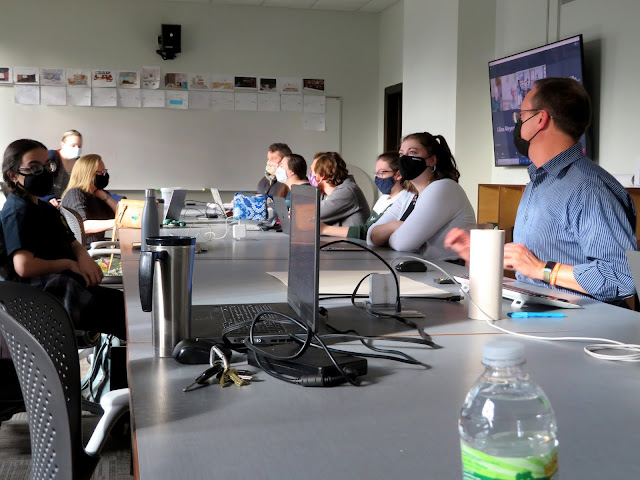
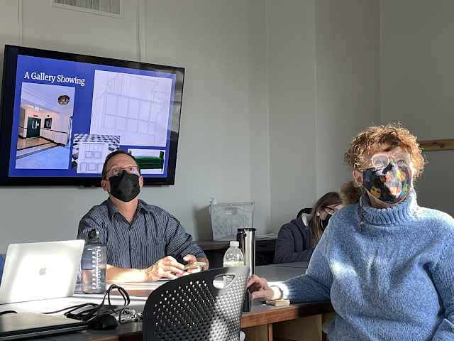
Two weeks later, I attended the presentation and I was blown away by the creativity of the students and how they incorporated things they picked out of my talk and reflected those ideas in their designs. No budget number was put onto the project, which made it extra fun.
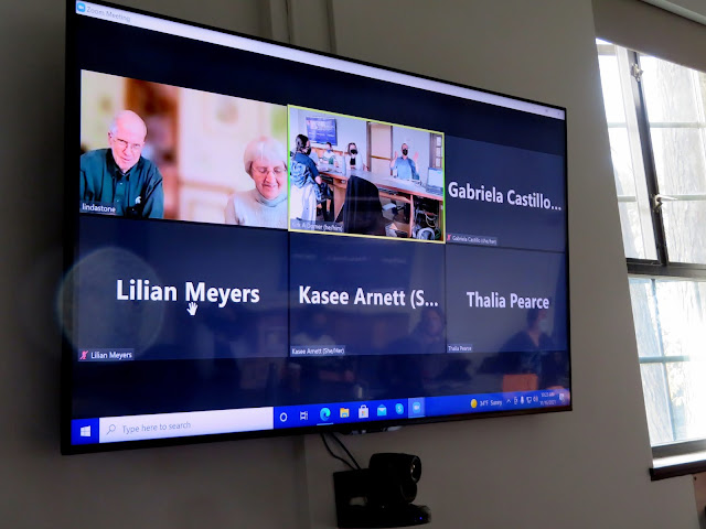
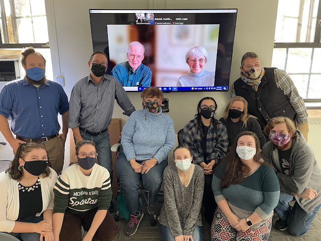
My friends and mentors Linda and Larry Stone, also graduates of the program and supporters of the university theatre, Zoomed in to weigh in on the designs, too!
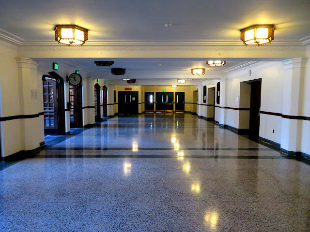
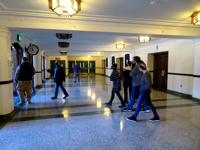
This is the lobby as it is now, with people walking through to give you an idea of the cavernous space. The building opened in 1939 and it's the same old crappy floor, blank dull walls and dim lighting (though the fixtures are nice.)
I wish I had photos of all the designs for sets and costumes. Some of mine just didn't come out. But you can get the idea here that these students have much to offer in their future.
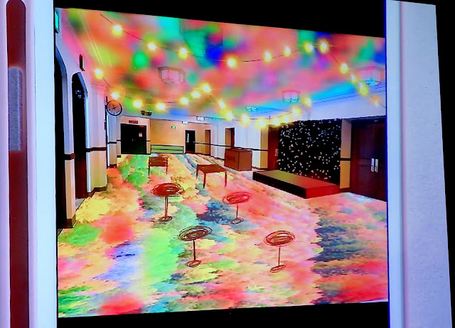
Mona, who presented first, lost the bad floor and put in a stained glass floor, underlit that would reflect on the ceiling. With sparkly lights, it was bright, simple and flexible.
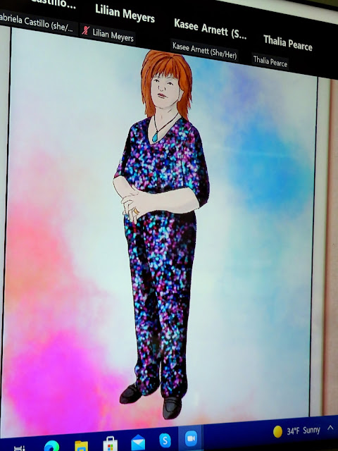
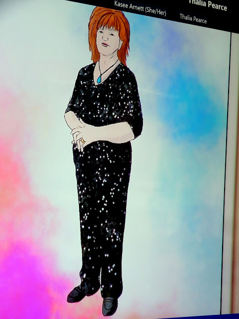
For an opening night outfit she created a sparkly jump suit and statement necklace. The fabric of the sequined jump suit is the type that when rubbed against the nap, it changes colors so it went from this...
....to this! Very clever. Her concept what I, too, would be a "transformative piece of art."
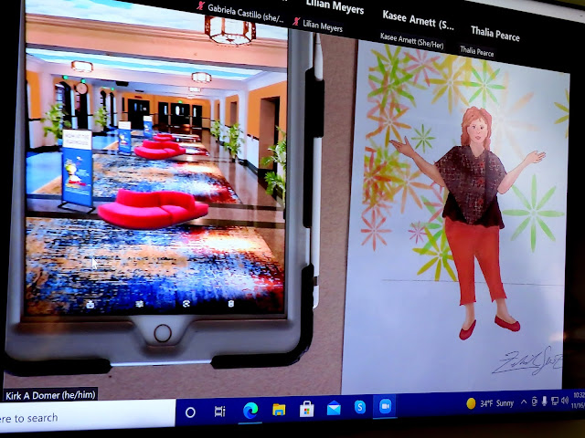
Zach was up next. He's a third year lighting designer. He changed the colors of the drab walls to a a peachy shade and placed large colorful rugs on the floor to brighten things up. He also added settees to allow a spot for patrons to rest. His outfit was fun, more casual and flexible in that it included a removable poncho. (You'll note that all designers put me in flat shoes! I had mentioned in my original talk my challenging feet!)
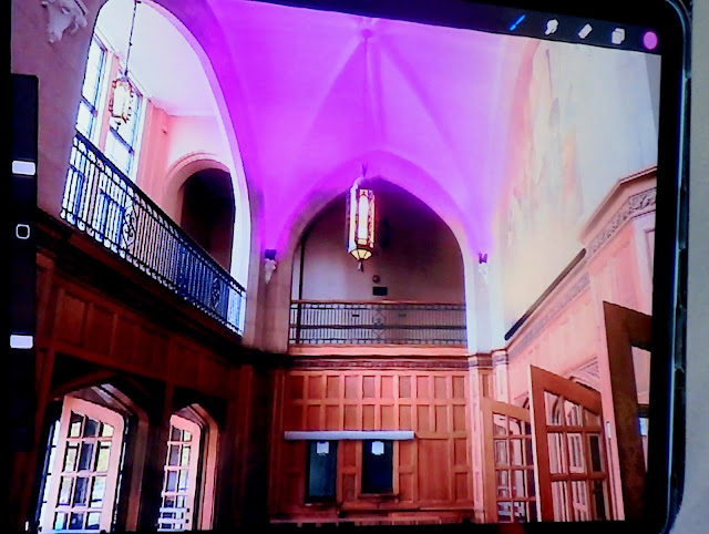
Nick is also a lighting designer and he started his presentation in the auditorium's vestibule, which would never be changed, with its classic wood and floor and WPA murals. However, he added a lighting element which would make one's first thought at entering the building that something exciting was in store.
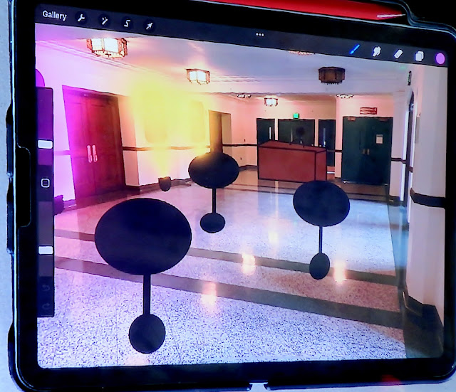
Nick also added a bar and round tables and a stage for an open mic night or pre show. His outfit was a comfy, billowy jumpsuit.
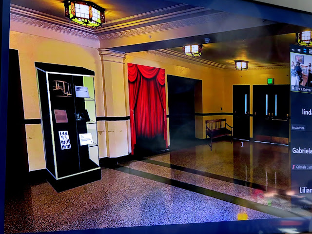
Lili is a first year lighting designer. She focused on the space using not only its university connections but its community connections with bulletin boards for local information. She kept the original lights and added display space for department students to show models and designs. That curtained area is a photo booth to encourage social media postings.
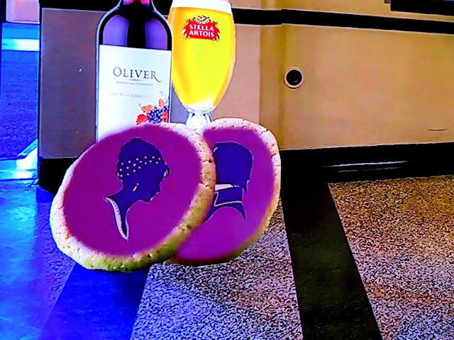
She also came up with the idea of themed cookies or snacks, like "Pride and Prejudice" cookies for that play.
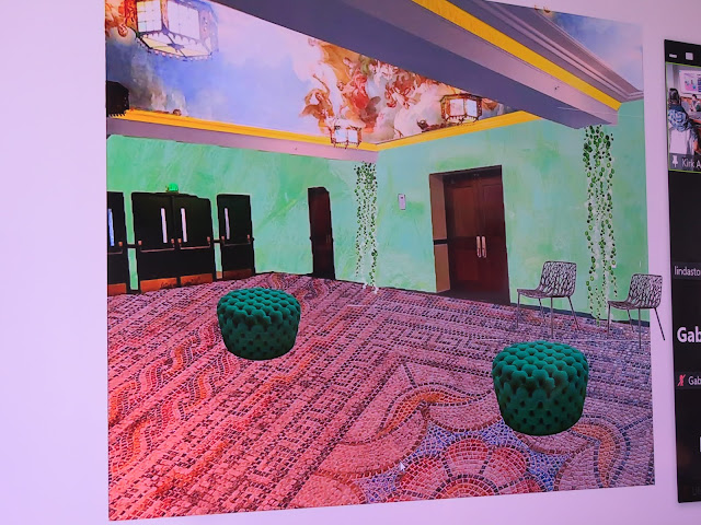
Quinn is a media designer and reated the space as an old world garden. My favorite element of this one was the magnificent mosaic floor, with a painted ceiling reminiscent of those one sees in European palaces.
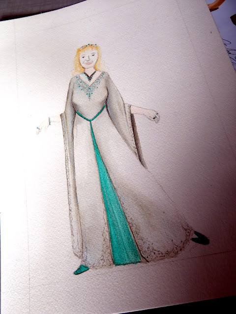
One of the things I mentioned in my first presentation was that the first play I ever saw, when I was four, was "Robin Hood" and how mesmerized I was by the gorgeous costumes, like a fairy tale book coming to life. So she made me my own Maid Marion gown!
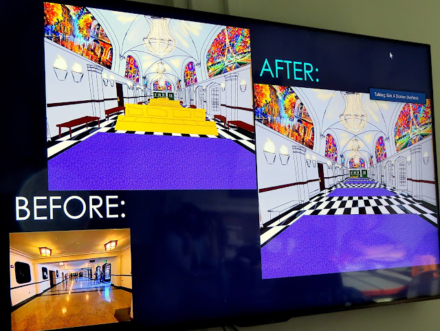
Kasee is a second year scenery and costume designer. She brought lots of purple into the space with purple carpeting, bright murals and bringing the black-and-white floor from the outer vestibule into the lobby space. She also had double sided couches so there was plenty of seating space. She also reconfigured the ceiling to match the higher ceiling in the outer vestibule and give the element of space a greater degree of height.
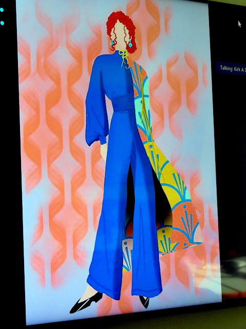
Her opening night ensemble was definitely me -- a bright turquoise, 30s Hollywood-style jumpsuit with a long, colorful swinging coat. (I also liked that her drawing shed about 40 pounds of me!)
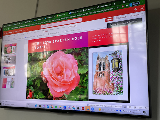
Thalia, a first year scenery designer, based her design on the (MSU) Spartan Rose and on some of my art (the one here is MSU's Beaumont Tower).
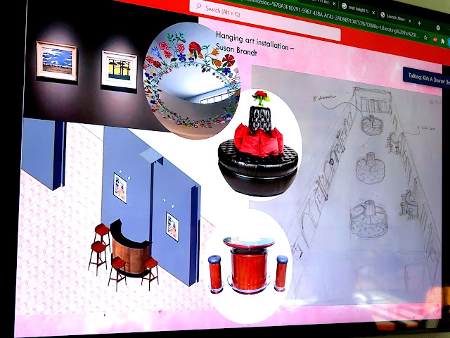
One of her ideas was to install a permanent gallery space, which could feature work of department or of art students and include the history of the building or department or art for or by kids. She also featured portable circular bars for events.
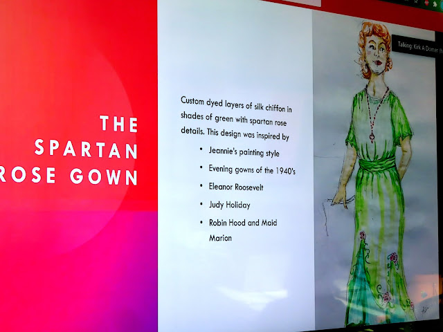
She said the green gown with the Spartan Roses was inspired by my art (I had shared some of the things I do with them at their request).
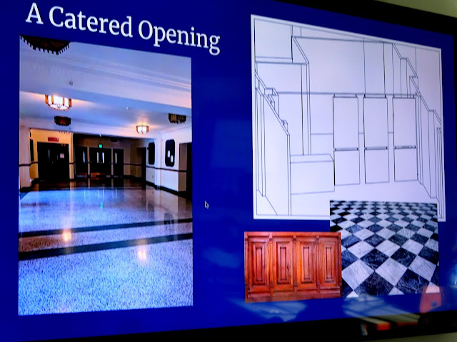
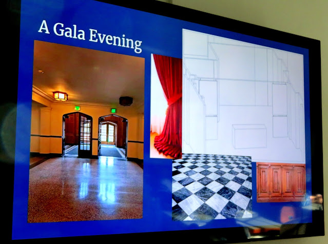
The last student was Gabby, a first-year scenic designer. She, too, brought the checkerboard floor from the outer vestibule into the design space and included bench seating...
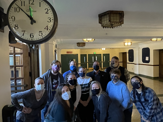
After the presentations, we all posed for a couple of photos!
It was a terrific day -- fun for me to look back, fun to see the remarkable work by the students.
Most of all, it was very rewarding to know that the program from which I graduated is doing some wonderful things -- and has a huge young talent pool to work with!
(Thanks to MSU's Abigail Tycocki for supplementing my photos!)



50 comments:
What a great collection of design possibilities -- you clearly inspired some creative and beautiful responses! Any chance that any element of any of these might actually be implemented? I'd love to see that glowing stained glass floor! Also... if you ever end up with something like that colorful cloak or the Spartan Roses dress, promise us that there will be pictures, ok?
They did a great job!!
I've been away, again. Wow, you are doing some exciting stuff! Your blog has a new look.
What fun for you and those students. They all did a fabulous job with the assignment but I liked Nicks the best because he kept the historical look of the place but added a twist that made it come alive and modern looking. I also loved kasee's jumpsuit. It was elegant and you can never go wrong with a design that shaves a few pounds off us. LOL
How fun was this! If I could see any of their designs put into place, I'd most like the first one with the stained glass floor, I think.
What a wonderful exercise! Wish I had been there. So many good ideas for updating the area. Really loved the opening clothing. You would look great in them.
What a fun project. I love what each of them did. My favorite outfit is also the turquoise jumpsuit. I think my favorite redo on the space was the second one with peachy walls. I did gravitate toward the ones with color. The social media booth was a clever idea too.
What a talented group!
It sure sounds like a fun presentations and outcomes. All the students did fantastic. You can see how creative they are and all have such a variety of ideas. I too love the blue jumpsuit with scarf. Tres chic!
What a fun project for you to be a part of. And it sounds like there's some amazing talent there.
It's wonderful when your passion continues for your whole life. Every time I lead a walk or give a lecture I pinch myself. There is little better than being able to pass on your knowledge to others. I am sure you knocked 'em dead, Jeanie - or perhaps just caused them to break a leg!
As theater designs, the ones displayed in your post are perfect : glass or mosaic floors instead of the classic wood, lively lighting, portable bars for events.
I like the outfits designed for you. Flat shoes for me too, please!
Didn't they do well, this was so nice to see.
All the best Jan
Very creative.
How fantastic is this! Seriously I want Mona to be my friend. She can redo lots of things for us! :D
What a fun, unique and exciting thing to be a part of. I love the mosaic floor and painted ceiling. And Maid Marion would be so fun to wear. I will say the choice of dresses for you to wear would be a hard pick. This is not only a great assignment for the kids, but a way to feel apart of your alma mater too. Thanks for sharing this fun thing you got to do Jeanie.. I enjoyed this post. Hugs-Erika
Being in design myself, it was very interesting how these young designers incorporated the space. You will need to tell us if one is a winner. Janice
What a talented group of future designers! Their assignment upgrades were all very imaginative and creative with a wonderful use of color.
How inspiring, Jeanie. I am impressed at how you inspired these young artists/designers. My favorite was Zach's design and Kasee's opening night ensemble. I enjoyed seeing how their minds worked and how they rearranged that bare hallway.
how interesting to see how the same space can be transformed, I like Quinn's design the best but they all have elements I like. A stained glass floor is an incredible invention although may be slippery!
Very interesting, Jeanie. Love all the sets the students created, they have fabulous ideas. It's good to see young people bringing in new ideas. Hugs, Valerie
Hello Jeanie,
What a fun project for you and the students. You are an inspiration, it is wonderful to see the students creativity and talent. Well done! Take care, enjoy your day and week ahead! Happy Thanksgiving to you and your family!
Oh my goodness, what talent, and hiw very exciting to have inspired these kids as you did! I love Kasee's outfit for you, and I think I like Thalia's lobby ideas...
We have a very old auditorium in town that reminded me of this lobby. Ours has been replaced with a wonderful, new theater and museum.
Fabulous energy here!
This is so incredibly cool!
This is so fun! I was hoping you’d share their ideas. I love lots of what they came up with, but my fave is probably the mosaic floor! That blue outfit is my favorite! I bet it was invigorating to be around the students and hear their ideas!!!
Wow, what incredible designs! I hope some of their ideas are incorporated into a real update of that drab lobby.
So many wonderful ideas were shared. I was most intrigued by all the outfits designed for you. I think I would love you as Maid Marian! I'm surprised that in reality the walls weren't painted before. It is the easiest way to change a space. It's not even a nice color of gray for Pete's sake. I also want someone to make me 40 pounds lighter with a brush.
How fun..what a great experience!!
What an honor to be asked to speak to these creative students and inspire them to recreate the space! Their ideas are amazing, and the costumes they created for you are wonderful. I love Kasee's artistic style, lovely!
Jenna
Wow that's amazing! The whole approach to design is commendable
So very interesting. I like the idea of raising the ceiling if that is a possibility. It instantly opened the space and gave it life. So many good ideas.
Your talk had to be inspiring for so many good ideas to come forth to ponder.
How absolutely delicious some of these presentations are! Love all the outfits, one of each please! I'm a big preservation enthusiast, so any of the murals and floor treatments that would restore the building to what it might have been are great, but the artist in me---loves all the light shows and reflections by the lighting students. Great presentations, one and all! Very hard to choose!
Creativity galore!
Love the spartan rose gown. For some reason it seems so YOU !
I agree with the students that the lobby needs more COLOR.
Such great talent. It was fun to see the same set designed entirely different. I love stuff like this. The light effects are amazing. My cup of tea.
What a thrilling project to be part of - and central to! I'd be so excited if it had been me, wow! Fabulous. And, you are right, that is one talented group of young designers. I actually like the light fixtures and terrazzo style floor of the original art deco building, and loved the Zach's new colouring for the walls and ceiling, transformational. But I'd be up for Mona's wonderful illuminated stained glass experience if I was the billionaire funding this! And the changeable jumpsuit is a fabulous idea, really creative. This must be one of the most fun things I have read about in anyone's blog, ever!
I want them to make you all those outfits! What fun.
best… mae at maefood.blogspot.com
What fun this must have been Jeanie, to be right in there with this fantastic project. Loved all the creativity from your students. Thoroughly enjoyed looking in on all of this and thank you so much for sharing such an amazing experience. It must have been so rewarding for you, and for your students.
So many wonderful ideas! Oh, I wish I was that creative.
Reminds me a wee bit of when I studied, it was always great not only to come up with ideas but see what the other students did, too.
Looks like a fun time!
How wonderful to be a part of this program! They are a very creative group.
Your whole life seems lived in support of the arts:)
Truely, you have such an artful perspective. The way you spend
your days is inspiring.
I always enjoy tagging along via your shares:)
Thank you,
Jennifer
Haha. Well, you sure got your wish. Lots of bright colors and dramatic flourishes.
This is wonderful on so many levels, from them asking you to participate, to seeing their talent shine through in innovative designs! How fun that it included them designing a dress for you (loved the sparkly one). Looks like the future is bright with young talent.
What a wonderful post. Happy Thanksgiving.
Wow! These were so creative. I can see futures for each of them.
Jeanie what a wonderful project. I bet those youngsters were in awe of you. I especially loved the blue jumpsuit..Have a wonderful Thanksgiving..xxoJudy
Jeanie,
Very interesting and quite creative! I am sure it was so much fun!!Happy Thanksgiving to you and yours!! Thanks so much for all your visits and sweet comments...I am playing catch up,,,I finally finished decorating so now I can enjoy and relax!!
Hugs,
Debbie
These students are very creative and talented. This must have been so exciting and rewarding for you, Jeanie! Happy Thanksgiving~
Excellent work! I think I like Zach's idea the best -- the terrazzo floor isn't TERRIBLE, it's just very plain. His idea preserves it but boosts the color and adds furnishings and comfort. Points for that.
I think I like Kasee's outfit design the best. That coat is the bomb!
Jeanie, I am sorry to be so late with my comments.
This had to be such a special and fun event for you. The creativity of the students is amazing. They will go on to do great things.
Post a Comment